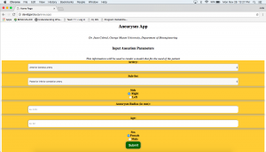
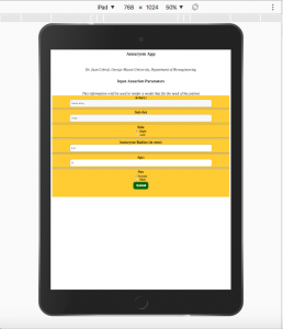
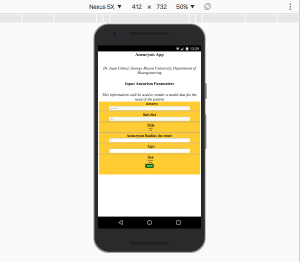
The team has begun to finalize the first version of our prototype, and the following figures show the user interface created. Figures 2 and 3 show the desired cross-platform abilities. Further updates on the outputs will be given soon.
Figure 1: The user interface for this web-application prototype. It includes drop down menus to choose an aneurysm’s location, and the ability for the user to specify side, radius, age, and gender. It is accessible through a web browser. This particular screen shot shows it was opened on a computer in Google Chrome.
Figure 2: The user interface for this web-application prototype on an Apple iPad. It is the exact same user interface as on a computer, but sized to the dimensions of the iPad. It includes the same options, functions, and interactive rendering.
Figure 3: The user interface for this web-application prototype on a Samsung Nexus 5X. It is the exact same user interface as on a computer, but sized to the dimensions of the phone. It includes the same options, functions, and interactive rendering.


0 comments ↓
There are no comments yet...Kick things off by filling out the form below..